Why don’t your stocks go up? You’re asking the wrong questions
Ever wonder why the stock of an energy company you love doesn’t go up? You’ve analyzed it and you think it’s undervalued. But the stock doesn’t go up.
Well, I just finished reading one of the best explanations of why that happens. It’s a November 2013 report from oil and gas analyst Kurt Molnar of the Canadian arm of Raymond James. He sent it out to his retail stockbrokers to introduce himself and his philosophy. It’s a heavy 40 pages, but it’s solid gold. And he has graciously allowed me to share some of the key points with my readers.
The simple answer to the question above is—because almost assuredly—you’re asking the wrong questions, and paying attention to the wrong metrics.
Many retail investors get lost in headline growth numbers—growth in production and revenue. Molnar suggests we should be focused on how much return a management team can get for every dollar they invest in their business.
In other words, quality is much more important than quantity.
Molnar thinks that investors need to “quality adjust” the metrics that energy producers report—specifically, three key data points:
- netback, or profit per barrel produced
- Growth in free cash flow—any cash flow over what it takes to keep the proved producing reserve level flat
- Return on invested capital
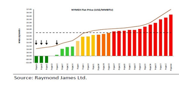
To help visualize what he is saying, Molnar has provided us with the concept of “the boot.”

The graphic above shows the break-even price for wells being drilled into various natural gas plays. You can see that the chart roughly forms the shape of the boot.
Molnar wants to invest only in companies that have assets located in the “toe” of the boot. These are the plays with the very lowest break-even costs, and generally the highest 1P recycle ratios. A 1P recycle ratio is the profit per proven producing barrel divided by the cost to get that proven barrel out of the ground.
Investors want to own stocks that have a higher recycle ratio—at least 2:1.
Over time what will drive company—and stock—performance is the return that it is generating on the cash it is investing. And the key to generating returns on cash being invested is to have low cost, high margin oil and gas wells; wells that reside in the toe of the boot.
When one company can invest its cash for the next 10 years into a hugely profitable play while another has only mediocre opportunities…that compounding interest will make it a far superior investment going forward.
Molnar is adamant that the best plays should have a big premium, and the lower quality ones should likely be valued lower than they are in today’s Canadian junior marketplace.
And it isn’t that headline growth isn’t good. The problem is that the market does a lousy job in evaluating how much money a company is making while growing. What really matters is how profitable that growth actually is.
These high recycle ratio companies are the ones that will generate the most wealth for shareholders. And not only does the toe-of-the-boot give the highest returns, he shows they are also the least risky.
They have the lowest full cycle development costs, so they continue to make money in low points of the commodity cycle. Meanwhile, the companies with only heel-of-the-boot assets will lose money drilling wells at low commodity prices.
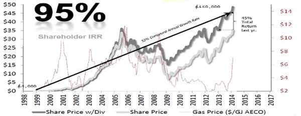
According to Molnar, the poster child for the type of company investors should be looking is Peyto Exploration (PEY:TSX).

In 2007 Peyto was 83% weighted to natural gas and over the next five years that weighting increased to 89%. Considering that over that same time period the price of natural gas dropped from $8.42/mcf to $3.46/mcf, you would expect that Peyto would have been suffering.
Instead the company has thrived.
That success is directly related to Peyto having assets that live in the “toe” of Molnar’s boot.
Peyto’s asset base allows the company to be the lowest cost producer. A company that can continue to be profitable and grow at commodity price lows and thrive when commodity prices are high.
Now, when I translate all that to my own experience learning about the oilpatch over the last five years, I realize I have never seen a comparison or “comp” chart of 1P recycle ratios from any brokerage firm in the US or Canada. That’s where the Top 30 juniors and intermediate producers in Canada and the US would be lined up and compared (hence the “comp” lingo) in a chart—like the boot above—ranked in order of 1P recycle ratio (which would be an average over the last three years).
{{ commodity.name }}
{{ post.title }}
{{ post.date }}


Comments