INFOGRAPHIC: A year’s extraction of metal shown next to landmarks and cities
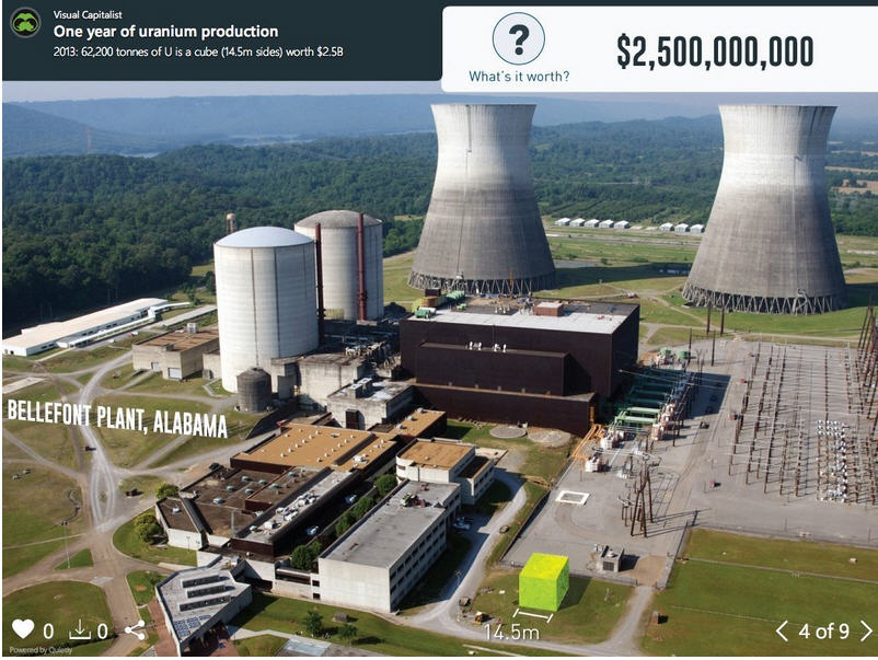
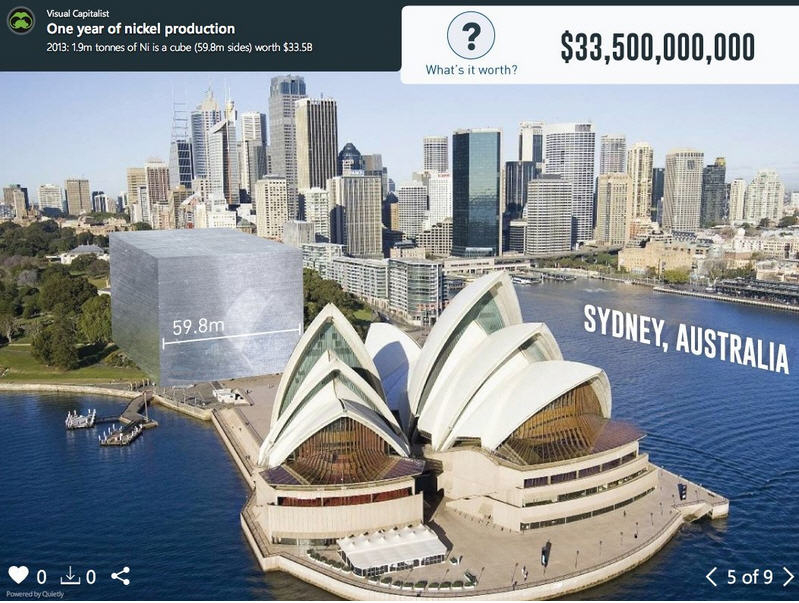
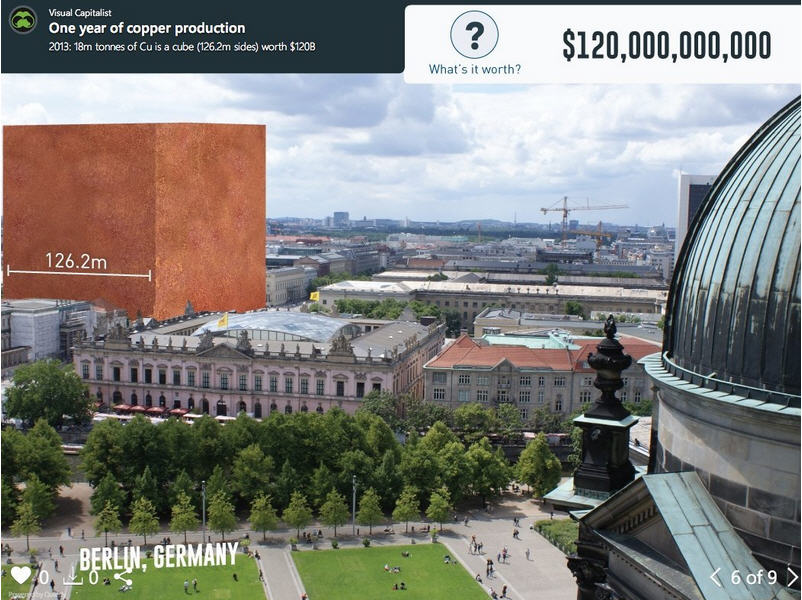
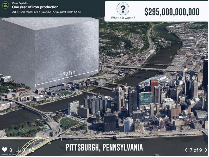
In today’s very special feature, we have created a slideshow visualizing a year’s production of various metals next to famous landmarks in cities.
“One death is a tragedy. One million is a statistic.” – Joseph Stalin
For thousands of years of development as a species, humans never really needed to understand the real meaning behind big, unreachable numbers such as billions or trillions. As a result, even today we have difficulty imaging what these seemingly abstract numbers represent.
This is why visualization can be such a powerful tool. Instead of dealing with zeroes, we get to actually see these large numbers applied in a way that we can relate to.
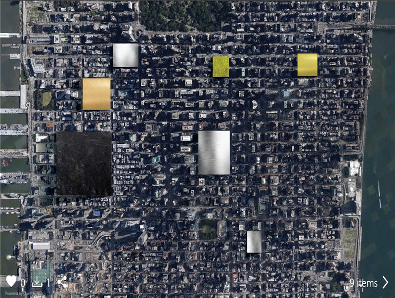
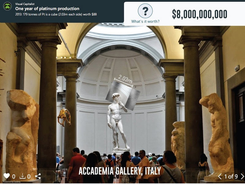
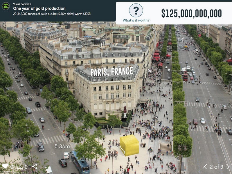
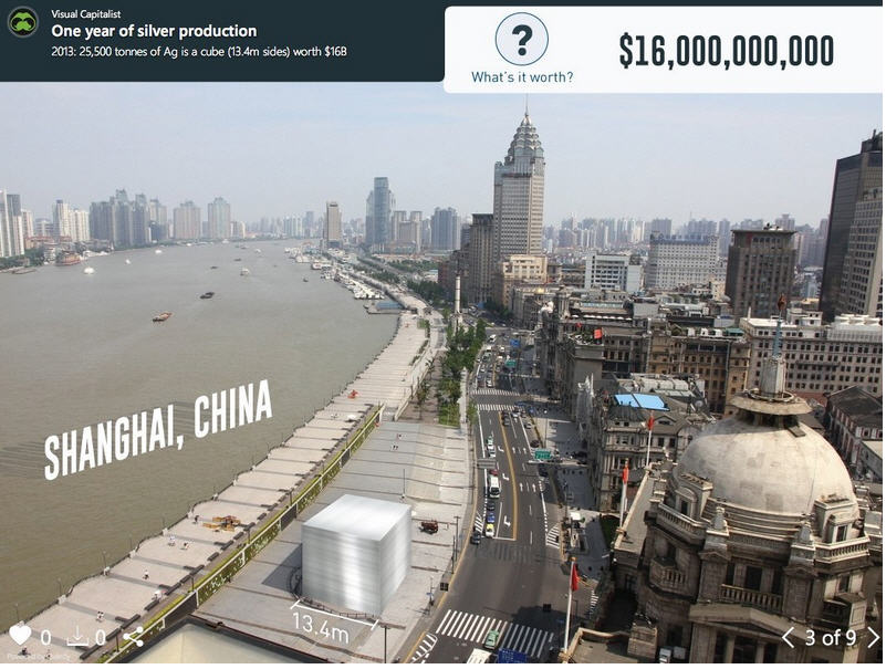
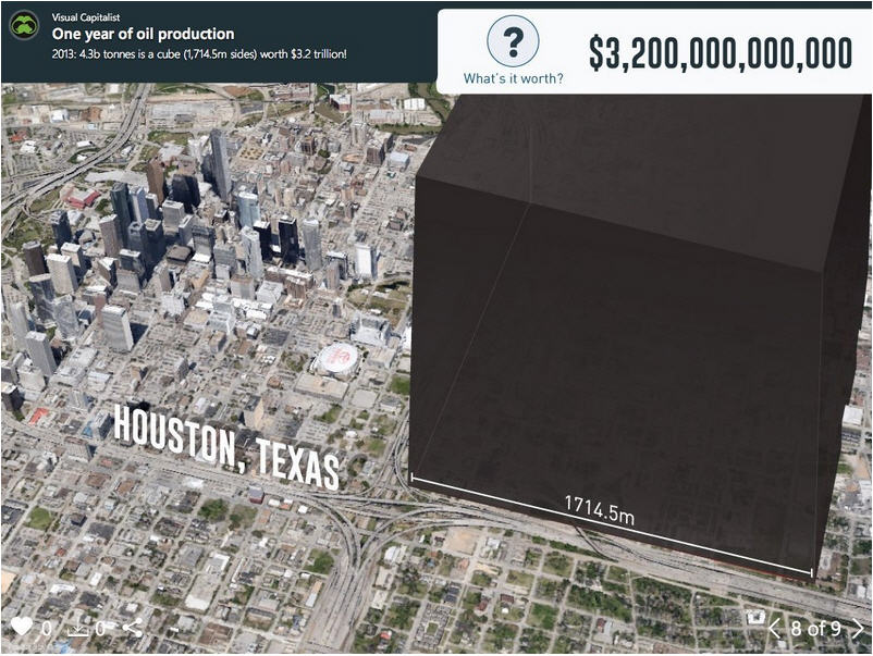
In the above slideshow visualization, we have taken the annual production of eight major commodities (platinum, gold, silver, uranium, nickel, copper, iron, and oil) and imagined that we could lump them together into a large 3d cube. Then, we put the cube within context of a visual scene that we can contrast them with. In this case, famous landmarks and cities.
Some cubes, such as platinum’s, are only the size of a Volkswagen. Others, such as oil, are kilometres on each side and span blocks of major cities.
We also calculated the value of each cube. Amazingly, all precious metals (gold, silver, platinum, palladium, etc.) do not even come close to comparing to the value of iron or oil. It goes to show how rare they are, but also that the size of their markets are sometimes not as massive as we think within the context of the bigger picture.
Jeff Desjardins
More News
{{ commodity.name }}
{{ post.title }}
{{ post.date }}

7 Comments
SCSF kingbeez
It would be a better comparison if you include total amount of extracted material for each commodity. Then you would see real world impact
Mark Hinton
Still no impact as far as global is concerned. The whole area that mining occupies is far less than one big city and there are many let alone all the others and the rest of the cities and towns in the world. Sure there are underground operations but the distance to the core of the earth is some 6200km and the deepest mines are less than 4km so again not a great deal. The biggest threat to the world are the people and their consumption. Otherwise known as consumerism. If we could stop using so much power, driving so many cars and wishing to replace to so many items with new on a yearly basis we would need less. Simple.
I Survey stuff
Not sure why they’ve showed a big bucket of oil when the title is metal extracted. But for the sake of comparison, a big box of coal is only a mere 2100m around surprisingly based on 2013 production.
It would make for a big block of flats however…
bill
“There are three kinds of lies: lies, damned lies, and statistics.” – Disraeli.
The images are clinical. But they ignore waste. The cube for “ore and waste’ to go with the gold image (#2) would be about the same size* as the oil image #8 (~1.7km cube).
* using densitiy of 19.3 for gold. assuming average gold grade of 1.8g/t, density 2 for ore and waste, and a strip ratio of 5.
I Survey stuff
“All the waste in a year from a nuclear power plant can be stored under a desk.” – Ronald Reagan
I do agree with you somewhat Bill. Assuming all gold mined came from an open pit gold mine perhaps. But in reality a lot is extracted from copper and other base metal mines, both open pit and underground.
You can share some of that cube with the other slides, however, it would be a really big sandpit to play in for all mining waste.
Rod
I have often wondered how the total area of stores constructed by Wal-Mart and The Home Depot compares to the surface area of all mining waste. There are 11,000 stores for Wal-Mart and 2,256 for Home Depot. One Wal-Mart in Tucson has 62,390 square meters (0.67 sq. miles) of store plus parking (not including perimeter drive and access roads to the store). One of the Home Depot stores in Tucson has 39,588 square meters (0.50 sq. miles). If these store areas are typical, between the two companies, they occupy 8,500 square miles of Earth surface. Of course, they would not need but 10% of that area to conduct business, if mining for iron, nickel, copper and zinc were to be suspended.
Rod
The surface area of Connecticut is 5,543 sq. miles. Area of Vermont is 9,620 sq. miles…So, the area of Wal-Mart plus Home Depot is between these two.