IAEA launches easy to use digital map of world’s uranium distribution

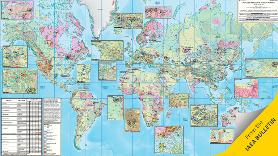
The International Atomic Energy Agency (IAEA) has launched a comprehensive, online interactive and integrated digital map of the world’s uranium distribution and deposits. This second edition of World Distribution of Uranium Deposits was developed with contributions from the Saskatchewan Geological Survey, the Geological Survey of South Australia and the United States Geological Survey.
This edition classifies information by types of deposits and is unique in that it carries a vast amount of new information and knowledge — consolidating data from hundreds of public sources.
It is accessible to anyone online and offers advanced interactive tools.
“The aim was to create a complex map that is very simple to use,” said Martin Fairclough, a uranium production specialist at the IAEA and one of the map’s developers.
The map has been created for uranium resource and inventory management, geoscience research and the promotion of the discovery and use of uranium. It also provides data relevant to the implementation of nuclear power programmes around the world.
The map is based on data from the IAEA Uranium Deposits of the World (UDEPO)database, further outlined in the Geological Classification of Uranium deposits and Description of Selected Examples and the IAEA UDEPO 2016 edition documents. UDEPO is continuously being updated and includes technical information and detailed geological information on regions, districts and deposits. Both documents, which are complementary to the map, can be downloaded.
Since the publication of the first edition of the map in 1995, the amount of material and the diversity of information available in the world have expanded exponentially, hand in hand with advances in the understanding of uranium deposits. The first edition included 582 worldwide uranium deposits; this latest edition includes 2831.
“This latest map is a snapshot of all the current knowledge: a bundle of information, a visual representation of data from various technical documents, all summarized in one place,” Fairclough said.
The map is unique in how it displays this vast amount of information. It classifies the uranium deposits into 15 different types, as well as their subtypes. These are represented by different symbols that also proportionately show the deposits’ size. For instance, a star represents all the volcanicrelated deposit types, its colours represent its subtypes, and its size represents the deposit’s size in tonnes of uranium (tU). A green star, for example, would represent a volcano-sedimentary deposit subtype. And the bigger the green star, the bigger the deposit size.
The map’s special features allow users to organize and customize all this data. They can turn layers on and off, making them visible or hiding them. For instance, they can choose to display one type of uranium deposit and hide the other 14 types, and then print the version with the exact selected data they are looking for. The benefit of this is that one single product — the map — carries a vast amount of information classified in such a structured way that users can quickly produce a document containing precisely what they are searching for.
Another unique feature is that users can look into individual deposits by clicking on them to see in text format information related to that particular deposit. The map also contains a shaded relief background to simulate topography and enhance the relationships between geology and deposits.
The map can be accessed here.
{{ commodity.name }}
{{ post.title }}
{{ post.date }}


Comments