Calm before the storm
In light of the 30-year anniversary of the Black Monday Crash in 1987 (when the Dow lost more than 20% in “one day”), we should be reminded that investor anxiety usually increases when markets get to extremes. If stock prices fall steeply, people fret about money lost, and if they move too high too fast, they worry about sudden reversals. As greed is supposed to be counterbalanced by fear, this relationship should not be surprising. But sometimes the formula breaks down and stocks become very expensive even while investors become increasingly complacent. History has shown that such periods of untethered optimism have often presaged major market corrections. Current data suggests that we are in such a period, and in the words of our current President, we may be “in the calm before the storm.”
Many market analysts consider the Cyclically Adjusted Price to Earnings (CAPE) ratio to be the best measure of stock valuation. Also known as the “Shiller Ratio” (after Yale professor Robert Shiller), the number is derived by dividing the current price of a stock by its average inflation-adjusted earnings over the last 10 years. Since 1990, the CAPE ratio of the S&P 500 has averaged 25.6. The ratio got particularly bubbly, 44.2, during the 1999 crescendo of the “earnings don’t matter” dotcom era of the late 1990’s. But after the tech crash of 2000, the ratio was cut in half, drifting down to 21.3 by March of 2003. For the next five years, the CAPE hung around historic averages before collapsing to 13.3 in the market crash of 2008-2009. Since then, the ratio has moved steadily upward, returning to the upper 20s by 2015. But in July of this year, the CAPE breached 30 for the first time since March 2002. It has been there ever since (which is high when compared to most developed markets around the world). (data from Irrational Exuberance, Princeton University Press 2000, 2005, 2015, updated Robert J. Shiller)
But unlike earlier periods of stock market gains, the extraordinary run-up in CAPE over the past eight years has not been built on top of strong economic growth. The gains of 1996-1999 came when quarterly GDP growth averaged 4.6%, and the gains of 2003-2007 came when quarterly GDP averaged 2.96%. In contrast Between 2010 and 2017, GDP growth had averaged only 2.1% (data from Bureau of Economic Analysis). It is clear to some that the Fed has substituted itself for growth as the primary driver for stocks.
Investors typically measure market anxiety by looking at the VIX index, also known as “the fear index”. This data point, calculated by the Chicago Board Options Exchange, looks at the amount of put vs. call contracts to determine sentiment about how much the markets may fluctuate over the coming 30 days. A number greater than 30 indicates high anxiety while a number less than 20 suggests that investors see little reason to lose sleep.
Since 1990, the VIX has averaged 19.5 and has generally tended to move up and down with CAPE valuations. Spikes to the upside also tended to occur during periods of economic uncertainty like recessions. (The economic crisis of 2008 sent the VIX into orbit, hitting an all-time high of 59.9 in October 2008.) However, the Federal Reserve’s Quantitative Easing bond-buying program, which came online in March of 2009, may have short-circuited this fundamental relationship.
Before the crisis, there was still a strong belief that stock investing entailed real risk. The period of stock stagnation of the 1970s and 1980s was still well remembered, as were the crashes of 1987, 2000, and 2008. But the existence of the Greenspan/Bernanke/Yellen “Put” (the idea that the Fed would back stop market losses), came to ease many of the anxieties on Wall Street. Over the past few years, the Fed has consistently demonstrated that it is willing to use its new tool kit in extraordinary ways.
While many economists had expected the Fed to roll back its QE purchases as soon as the immediate economic crisis had passed, the program steamed at full speed through 2015, long past the point where the economy had apparently recovered. Time and again, the Fed cited fragile financial conditions as the reason it persisted, even while unemployment dropped and the stock market soared.
The Fed further showcased its maternal instinct in early 2016 when a surprise 8% drop in stocks in the first two weeks of January (the worst ever start of a calendar year on Wall Street) led it to abandon its carefully laid groundwork for multiple rate hikes in 2016. As investors seem to have interpreted this as the Fed leaving the safety net firmly in place, the VIX has dropped steadily from that time. In September of this year, the VIX fell below 10.
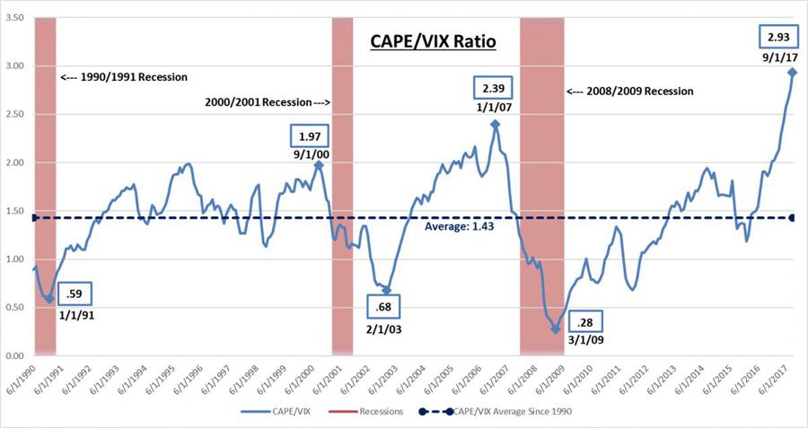
Untethered optimism can be seen most clearly by looking at the relationship between the VIX and the CAPE ratio. Over the past 27 years, this figure has averaged 1.43. But just this month, the ratio approached 3 for the first time on record, increasing 100% in just a year and a half. This means that the gap between how expensive stocks have become and how little this increase concerns investors has never been wider. But history has shown that bad things can happen after periods in which fear takes a back seat.

Past performance is not indicative of future results. Created by Euro Pacific Capital from data culled from econ.yale.edu & Bloomberg.
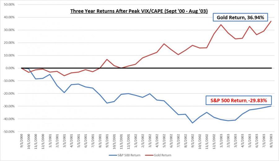
On September 1 of 2000, the S&P 500 hit 1520, very close to its (up to then) all-time peak. The 167% increase in prices over the prior five years should have raised alarm bells. It didn’t. At that point, the VIX/CAPE ratio hit 1.97…a high number. In the two years after September 2000, the S&P 500 retreated 46%. Ouch.
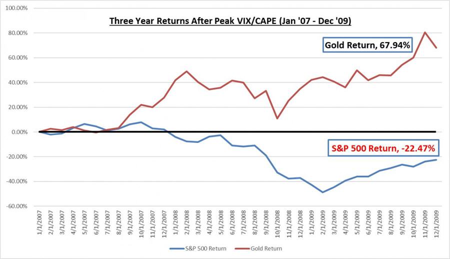
Unfortunately, the lesson wasn’t well learned. The next time the VIX/CAPE hit a high watermark was in January 2007 when it reached 2.39. At that point, the S&P 500 had hit 1438 a 71% increase from February of 2003. As they had seven years earlier, the investing public was not overly concerned. In just over two years after the VIX/CAPE had peaked the S&P 500 declined 43%. Double Ouch.
For much of the next decade investors seemed to have been twice bitten and once shy. The VIX/CAPE stayed below 2 for most of that time. But after the election of 2016, the caution waned and the ratio breached 2. In the past few months, the metric has risen to record territory, hitting 2.57 in June, and 2.93 in October. These levels suggest that a record low percentage of investors are concerned by valuations that are as high as they have ever been outside of the four-year “dotcom” period.
Investors may be trying to convince themselves that the outcome will be different this time around. But the only thing that is likely to be different is the Fed’s ability to limit the damage. In 2000-2002, the Fed was able to cut interest rates 500 basis points (from 6% to 1%) in order to counter the effects of the imploding tech stock bubble. Seven years later, it cut rates 500 basis points (from 5% to 0) in response to the deflating housing bubble. Stocks still fell anyway, but they probably would have fallen further if the Fed hadn’t been able to deliver these massive stimuli. In hindsight, investors would have been wise to move some funds out of U.S. stocks when the CAPE/VIX ratio moved into record territory. While stocks fell following those peaks, gold rose nicely.

Past performance is not indicative of future results. Created by Euro Pacific Capital from data culled from Bloomberg.

Past performance is not indicative of future results. Created by Euro Pacific Capital from data culled from Bloomberg.
But interest rates are now at just 1.25%. If the stock market were again to drop in such a manner, the Fed has far less fire power to bring to bear. It could cut rates to zero and then re-launch another round of QE bond buying to flood the financial sector with liquidity. But that may not be nearly as effective as it was in 2008. Given that the big problem at that point was bad mortgage debt, the QE program’s purchase of mortgage bonds was a fairly effective solution (although we believe a misguided one). But propping up overvalued stocks, many of which have nothing to do with the financial sector, is a far more difficult challenge. The Fed may have to buy stocks on the open market, a tactic that has been used by the Bank of Japan.
It should be clear to anyone that since the 1990s the Fed has inflated three stock market bubbles. As each of the prior two popped, the Fed inflated larger ones to mitigate the damage. The tendency to cushion the downside and to then provide enough extra liquidity to send stock prices back to new highs seems to have emboldened investors to downplay the risks and focus on the potential gains. This has been particularly true given that the Fed’s low interest rate policies have caused traditionally conservative bond investors to seek higher returns in stocks. Without the Fed’s safety net, many of these investors perhaps would not be willing to walk this high wire.
But investors may be over-estimating the Fed’s ability to blow up another bubble if the current one pops. Since this one is so large, the amount of stimulus required to inflate a larger one may produce the monetary equivalent of an overdose. It may be impossible to revive the markets without killing the dollar in the process. The currency crisis the Fed might unleash might prove more destructive to the economy than the repeat financial crisis it’s hoping to avoid.
We believe the writing is clearly on the wall and all investors need do is read it. It’s not written in Sanskrit or Hieroglyphics, but about as plainly as the gods of finance can make it. Should the current mother-of-all bubbles pop, for investors and the Fed it won’t be third time’s the charm, but three strikes and you’re out.
Read the original article at Euro Pacific Capital
Best Selling author Peter Schiff is the CEO and Chief Global Strategist of Euro Pacific Capital. His podcasts are available on The Peter Schiff Channel on Youtube
More News
{{ commodity.name }}
{{ post.title }}
{{ post.date }}


Comments