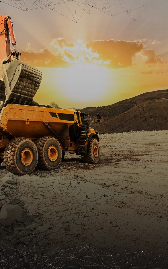
Flashback Friday: The world’s scariest mining chart
After a more than three years slump, 2016 has brought much-needed relief for the mining industry.
With a couple of exceptions – notably potash and uranium – the gains in metals and minerals prices have been broad-based and substantial. The rally in coal and iron ore surprised even the most ardent bulls, while crude oil’s recovery has helped to underpin prices for most raw materials.
In the last bear market, capex only recovered to its pre-crash level after seven years
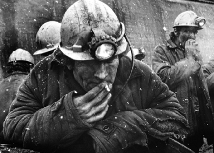
A short year ago the fundamentals and the mood in mining was very different. On September 21 last year MINING.com published what would become one of our most popular posts of 2015.
The question was how much longer the bear market in mining and metals would last.
The prognosis at the time was not good. A report by SNL Metals & Mining compared the current downturn to the previous bear market in mining which ran from 1997 to 2002 and argued that miners “should brace itself for at least another two years of shrinking budgets and outlays with the first signs of a subdued recovery only appearing early in 2018”:
But even this prediction could be too bullish.
Worryingly, metal prices have already fallen 12% further than they did during the bear market in the 1990s. In the last bear market, capex only recovered to its pre-crash (1997) level after seven years (2004).
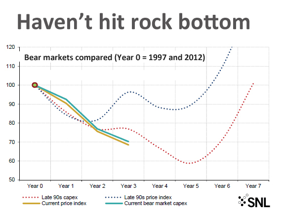
Source: SNL Metals & Mining
Click here for the complete original post.
{{ commodity.name }}
{{ post.title }}
{{ post.date }}

2 Comments
Eliminate Mercury
Stupid article
BD
Stupid comment