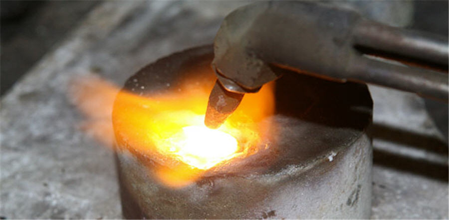
July 20, 2017 Acquisition of Canadian gold company contributes to pressure on stock In resuming coverage of Eldorado Gold following the acquisition of Integra Gold and its Lamaque property, BMO Capital Markets analyst Andrew Kaip looked at the impact of the move, as…
July 20, 2017 Nevada and Canada miner reports Q2 production up 94% Klondex Mines Ltd. released its second quarter operating results on July 18, reporting record production and sales.
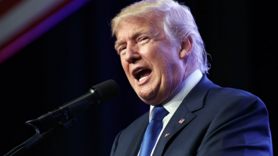
July 20, 2017 The Fed may show Trump no love Typically, U.S. Presidents are wary of claiming stock market performance as a referendum on their success.
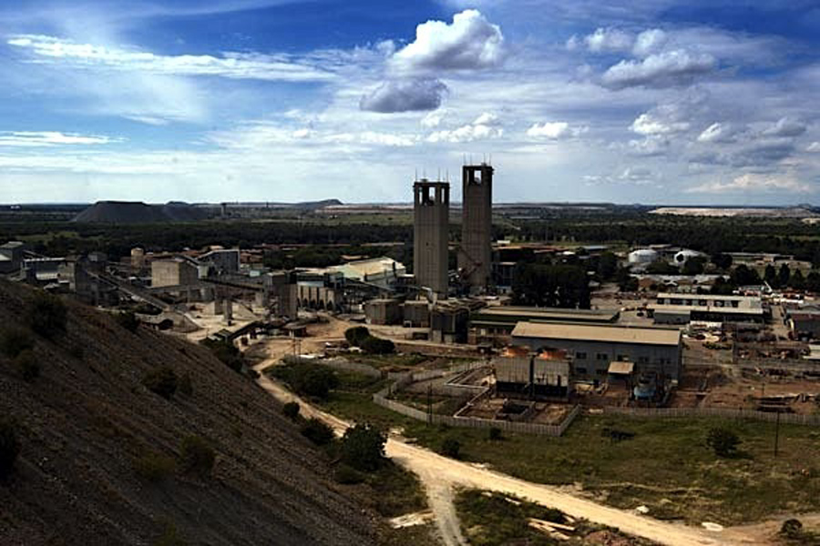
July 20, 2017 South Africa intends to suspend issuing mining rights South Africa intends to suspend the granting of applications for prospecting and mining rights as well as any renewals pending a court case to review new mining laws, the Mineral…
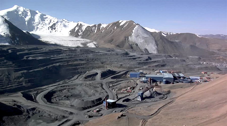
July 20, 2017 Centerra gets some breathing room in dispute with Kyrgyz Republic The arbitrator has sided with miner, allowing it to move forward with the case against the Central Asian country.
July 19, 2017 U.S., Chinese officials conclude contentious economic talks, steel stocks soar The United States and China failed on Wednesday to agree on major new steps to reduce the U.S. trade deficit with China, casting doubt over President Donald Trump's economic and…
July 19, 2017 US uranium company advances its assets With core drilling and underground development nearly complete at its Canyon Mine and progress noted in other aspects of this company's business, Rodman & Renshaw analyst Heiko Ihle provided an…
July 19, 2017 China Minmetals, China National Gold ‘unaware’ of merger talks Sources with knowledge of the matter told Reuters on Tuesday that China was considering a merger between the two major metals and mining firms as Beijing pushed to consolidate its…
July 19, 2017 Peru hit by nationwide mining strike; govt says situation ‘under control’ The indefinite labour action involves 56 unions, which are protesting a government’s proposed reform they see as "anti-workers".
July 19, 2017 Gold’s win streak at risk as dollar crawls up from 10-month lows Gold prices moved lower Wednesday as a weaker dollar stabilized, putting the yellow metal at risk of snapping a three-day win streak.
Hedge funds cut bullish gold wagers to lowest in 15 weeks Hedge funds and other large speculators reduced net-long positions by 23%. February 06, 2026 | 03:33 pm