Mining’s old guard needs strong medicine
A new report details subpar investor returns in the mining industry over the last decade, particularly big cap diversified companies which have not adapted to new realities.
Today we share with you five charts that summarize why gold stocks have never been cheaper.
The blessing and curse of being a contrarian is this: an inevitable outcome is recognized well before it comes to fruition. Even though profitable opportunities may be identified well in advance, it can take so long for hallmark events such as capitulation to happen, that it gives ample time to second guess one’s convictions.
We’ve believed, even before the correction that has recently hit U.S. markets, that the bear market for gold was long in the tooth. With asset bubbles all over the place, it has seemed for awhile that gold and silver were the only assets that were reasonably priced. Then yesterday, our friends at Palisade Capital sent us over five charts on why they believe that gold stocks are the most undervalued that they have been in decades.
We tend to agree with that sentiment, which is why in last week’s chart of the week we predicted that gold had already bottomed and that it had nowhere to go but up. (We further predicted that other commodities such as base metals would continue to get routed for the time being, and that U.S. equities would not return to the same levels for awhile.)
In any case, here are the charts:
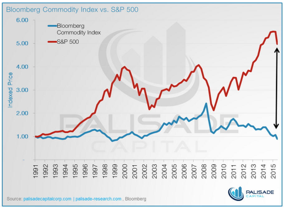
1. The divergence between the S&P 500 and Bloomberg Commodity Index is at an all-time high.
2. The bear market in the TSX Venture now stands at 1,090+ days.

The TSX Venture, the Canadian home to the majority of the world’s junior mining stocks, is still plagued with plenty of zombie stocks that amount to billions of dollars of negative working capital. The exchange and regulators have also been readily criticized for recent changes that limit access to capital from retail investors. However, in spite of all of this, there are truly some great projects and assets lying in some of the companies that have survived the onslaught. As you’ll see in the next chart, these companies have never been more undervalued.
3. Gold stocks have never been this cheap relative to the price of gold.

The Gold BUGS Index (HUI), which tracks the world’s largest gold miners, was last this low when gold was only $250/oz.
4. The gold bear market is closing in on being the longest in BGMI history.

Using the Barron’s Gold Mining Index (BGMI), this is already the worst bear market for gold miners. However, in just a couple of months, it will also surpass the 1996-2000 bear market as the longest.
5. The ratio between the gold/silver sector to the S&P 500 is unprecedented.
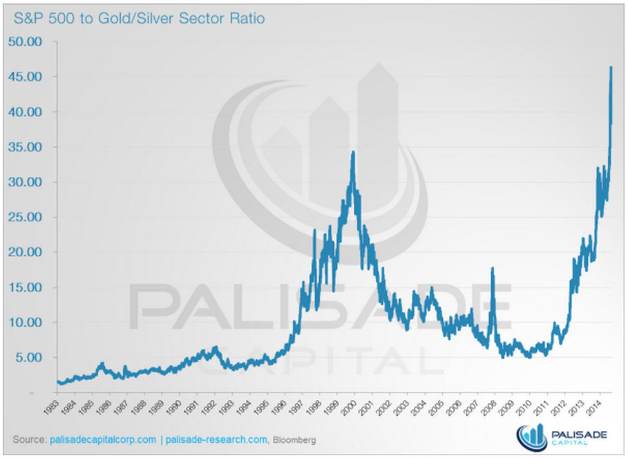
When pricing the S&P 500 in terms of the Gold/Silver Sector Index (XAU), it has never been this expensive. Put another way: gold and silver has never been this cheap.
Chart credit to: Palisade Research and The Daily Gold