Five charts showing why gold stocks have never been this cheap! – 1 year later

Almost one year ago we released these five charts, demonstrating the extreme nature of the bear market in gold stocks. The charts went viral and since then gold stocks have recovered just as we predicted.
Fortunately, there is still significant upside on table. The updated charts make a compelling case we are in the very early stages of a gold recovery – your portfolio is going to want you to check it out.
1.

It appeared the gap between the S&P and the Bloomberg Commodity Index was finally beginning to close when we first published this chart. However, it was apparently just a flash crash for the S&P 500 as the index continues to climb, while commodities in general continue to languish. Gold remains the strongest commodity, however, its recovery still has not been able to move the commodity index as a whole, unlike in previous bull runs.
2.

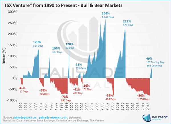
Investors rejoiced as the TSX Venture bear market finally ended after a staggering 1,200 days, when the index reached a record-breaking loss of 80%. We are now in a full-fledged bull market, however, there is a lot more room to run. The last two bull markets lasted 1,142 days and 573 days, respectively, and yielded returns of 266% and 222%.
3.

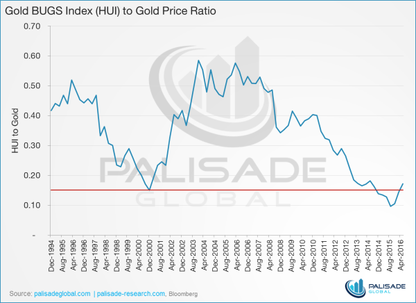
The ratio between the Gold BUGS Index and the price of gold finally bottomed out and is on the upswing. While gold stocks have been performing very well, the ratio just recently cleared its historical low achieved in 2000. With gold prices poised to continue to appreciate, not only does the HUI need to catch up, but needs to kick into overdrive to reach a historical median. These stocks scream buying opportunity!
4.

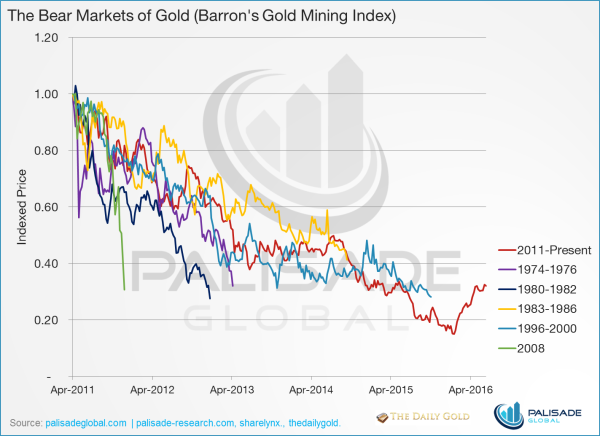
Playing off a chart made famous by our friend, Jordan Roy-Byrne, at The Daily Gold, it’s more than apparent that BGMI is finally on the mends. However, not after surpassing all other bear markets in terms of length and total loss.
5.

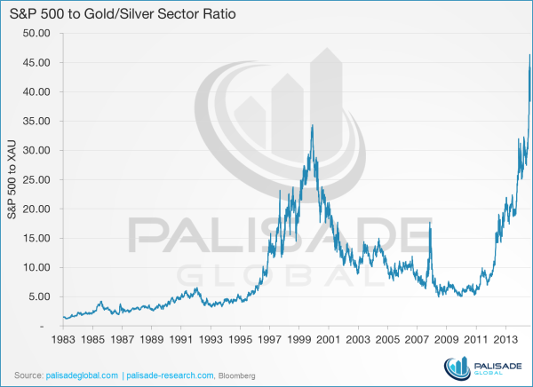
The divergence between these two indices remain exaggerated and unprecedented. Something has to give and our money is on both the S&P retreating and the gold/silver sector continuing to appreciate at a torrid rate.
{{ commodity.name }}
{{ post.title }}
{{ post.date }}


Comments